

EZRentOut has introduced a new capability to the powerful Custom Reports feature. Now you can plot selected data from Custom Reports and generate insightful graphs making it easier to interpret large datasets and extensive reports. Whether you want to do a comparative analysis or look at trends across the organization, you can use graphs to display information for internal use as well as outside the organization.
We offer multiple formats to choose from depending on your requirements. Take the power of data a step further and get instant visualization of key information.
Let’s take a deeper look:
Getting started with Graphs in Custom Reports
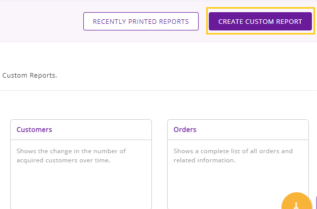
To get started navigate to More → Reports → Create Custom Report.
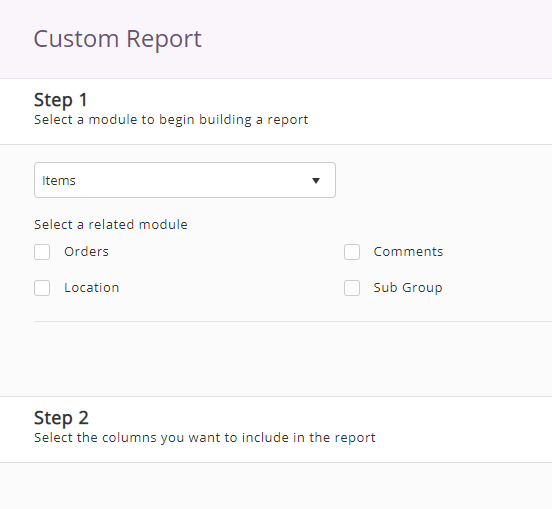
Now you can build your report from scratch. Fill in the Steps 1- 6.
To learn how to create a custom report, click here.
Creating graphs in Custom Reports
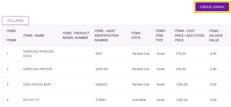
It is mandatory to run the report before creating a Graph. The ‘Create Graph’ button only becomes visible once you run a Custom Report. Now click on the “Create Graph” button as shown.
This directs you to the Graph engine and you will see the following menu. From here you can choose a format that would best illustrate your data.
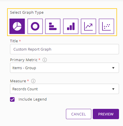
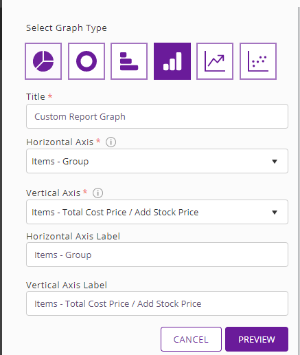
Here select the Graph Type, specify a Title for the Graph, select the Primary Metric (x-axis) and Measure (y-axis), and hit ‘Preview’. For example, a pie chart with the Primary Metric: Asset-Group and Measure: Records Count looks like this.
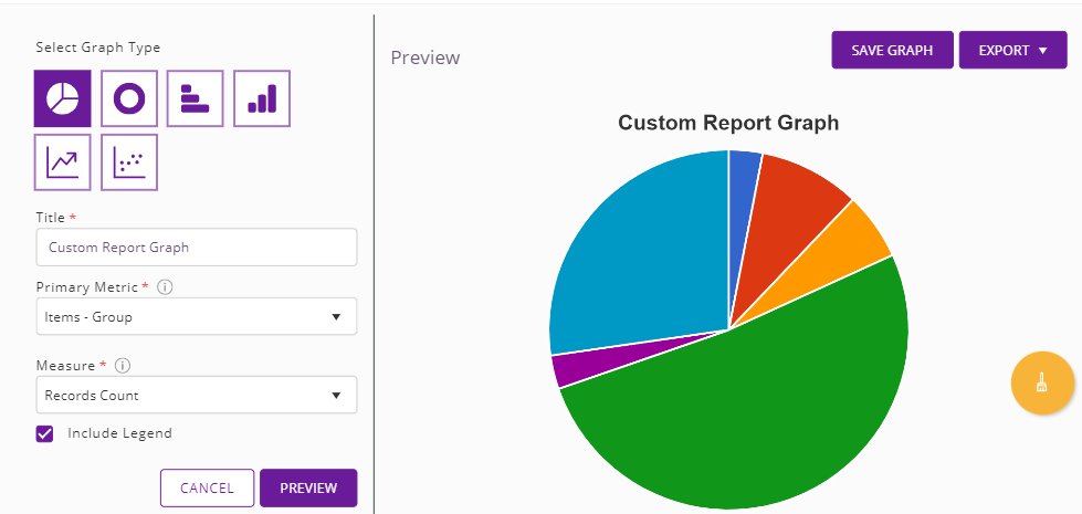
Here each portion of the pie chart represents the asset count in your Item Groups.
Use cases for Graph formats
You have the option of selecting from multiple formats:
- Pie chart
- Donut graph
- Vertical bar graph
- Horizontal bar graph
- Line graph
- Scatter plot
While setting the primary metric for these graphs, the axis dropdown options depend on the grouping applied in Step 4. In case you selected more than one option, only the first grouping column will be available. The other dropdown option can be Record Counts or one of the functions selected in Step 5.
Note: These options apply to all formats except the scatter plot.
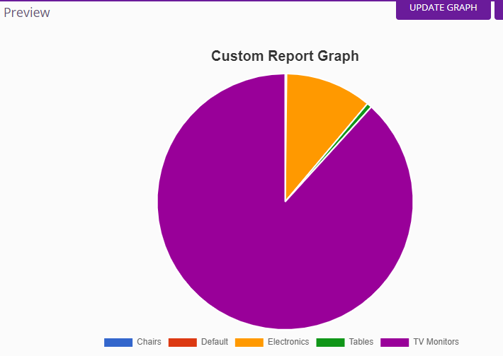
Pie chart and donut graph for proportionate comparison
These formats are useful when you want to compare data by ratios. For example, if you want to compare the prices of items in different Groups, you can use the pie and donut graphs to get a visual of this information.
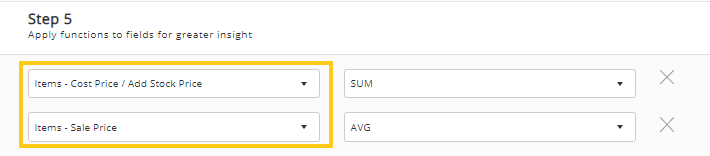
In the example below, we are using Groups as a primary metric and plotting the total cost of items in different Item Groups.
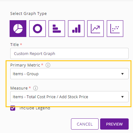
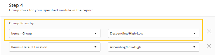
Here are the selections we made in the Step 4 and 5 of the report.

Now you can select these values from the dropdown menu.
Below you can see items from different groups represented by total price as part of a pie chart.
Likewise, you can generate a donut graph to plot the same data points.
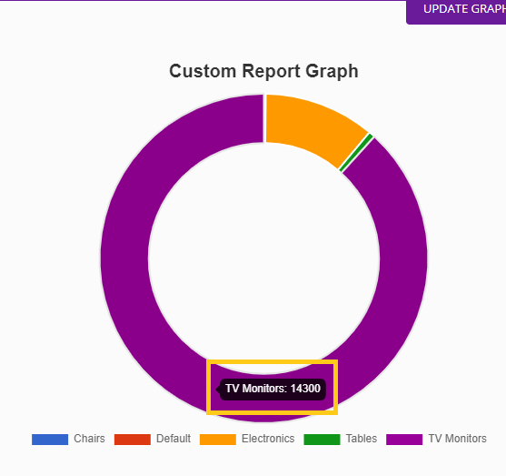
Hover over the relevant section to see the total price.
Vertical and horizontal bar graph for categorization
Use this format to compare data for meaningful business insights by classifying your data. You can use these to view the number of items or quantities that fall under certain categories.
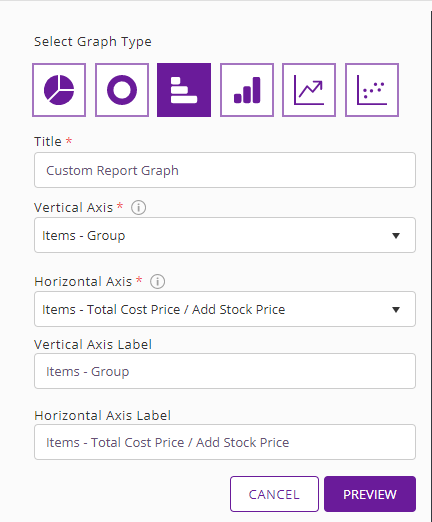
Here are Steps 4 and 5 from the report where we have selected item groups and the sale/cost price of items in those groups.


Select and plot these from the dropdown menu. You can also edit and name the Axis Labels per your requirement.
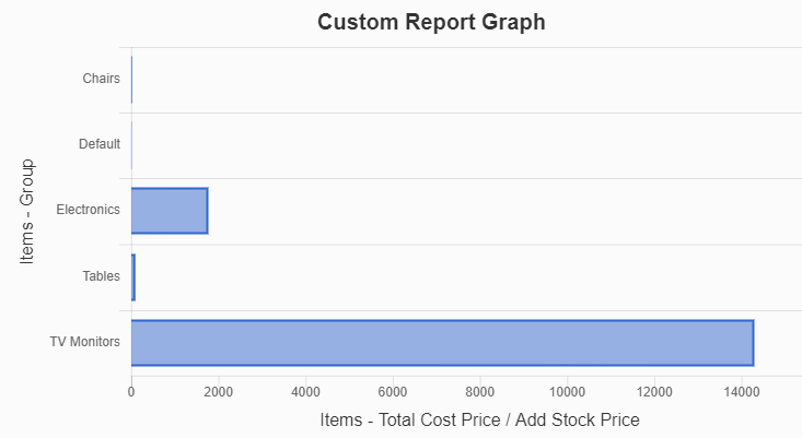
Here is what the the horizontal bar graph looks like.
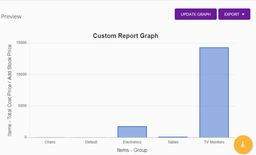
The vertical bar graph is similar to the horizontal bar except that its vertical axis shows the numerical data values as shown below. Below you can see that Groups will be plotted on the horizontal axis while total cost price will move to the vertical axis.
Line graph for trends over time
Use this format to look at trends across your business and make more informed business decisions.
As is the case with examples before this, you will plot the graph based on the values you selected in Step 4 and 5 of your report.

Now compare the total cost price of items across groups in this format and plot on the horizontal and vertical axis as follows:
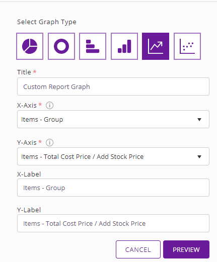
Here is the line graph for these values. As you can see, TV Monitors have the highest cost price, significantly higher than the other Groups.
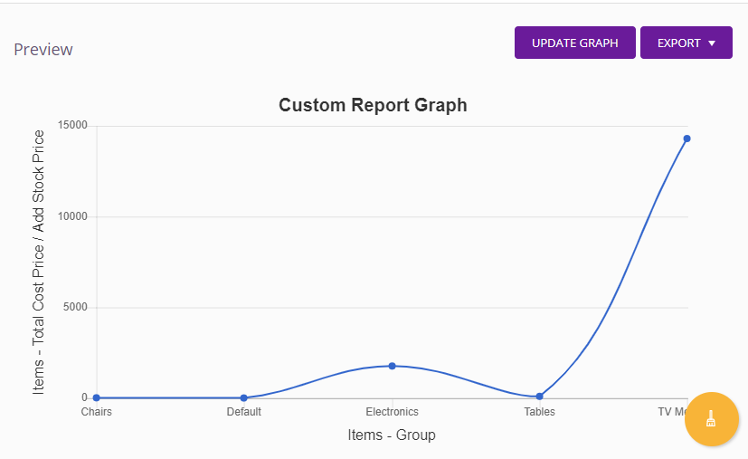
Note: This format is useful when you have a high volume of values along the x-axis and want a complete look at trends. Bar charts are not feasible in these cases since they are not able to plot more than a certain amount of values along the x-axis.
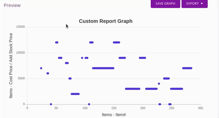
Scatter plot for data distribution
A scatter plot is typically used to study relationships between numeric variables. Here the data plotted will be based on the numeric columns selected in Step 2 while creating the Graph.
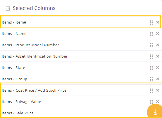
In this case, you will see that the horizontal and vertical axis both have the same dropdown options to choose from:
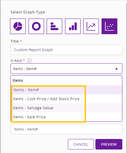
Now let’s create a Graph using Item# and Items – Cost Price. This is what the final graph will look like.
Data limit in graphs
An entry limitation of 200 is applicable across all graphs. In case your entries exceed this limit, those data points will not be plotted and you will see the following warning message.
![]()
You can define and control the number of entries by applying relevant filters to your reports.
Saving and editing graphs
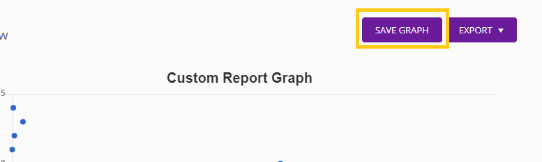
Once you have generated the graph you can save it as part of the report by clicking Save Graph on the top right corner.
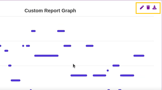
You can also edit, delete, and download your Graph as a PNG by clicking on the following highlighted icons.
About EZRentOut
We are a cloud based rental solution that offers businesses seamless rental management. It also comes with a host of other features like asset tracking, maintenance management, a customized webstore, and much more.